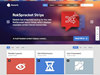


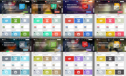
Inside Hexeris Template
The next generation layout and structure compliments the beautiful and intricate design of the template in conjunction with its many features and integrated extensions
Interested? Want to try Hexeris?
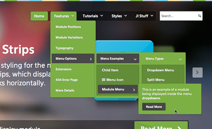
DownloadThis is an example of a module being displayed inside the menu dropdowns.
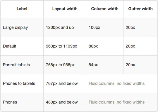
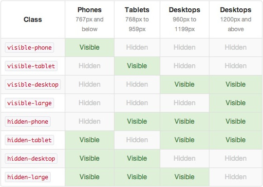
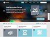
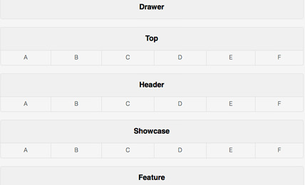
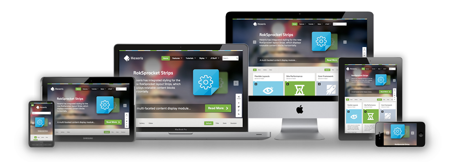
Responsive Layout
A responsive design automatically adapts itself to a particular viewing environment such as desktop, tablet or mobile, without the need for separate layouts for varying platforms
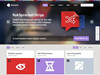
Inside Hexeris Template
The next generation layout and structure compliments the beautiful and intricate design of the template in conjunction with its many features and integrated extensions
Interested? Want to try Hexeris?
Download