-about

The SideSlider adds additional space for content outside of the main template area.

There are several options available for configuring the SideSlider feature, such as the toggle or whether it is fixed or slides into view.

The position is perfect for extra content or even full length advertisements.

-menus

Choose between two menu options: Dropdown Menu or Splitmenu; each with mobile support.

Dropdown Menu is a CSS based dropdown menu with advanced features such as multiple columns and inline module positions.

Splitmenu is a static menu choice with parent items in the header and children in the sidebar.

-G

A powerful, multi-platform, core template framework, which is free and licensed under GPL.

One of G's most notable feature is its custom user interface which provides an intuitive and user friendly configuration console.

A standardized set of features and capabilities are powered by G.

-popular

RSprocket is a powerful and flexible content switchblade extension

The extensions benefits from multiple layouts and numerous themes for most layouts, offering a wide assortment of possible content configurations.

A responsive layout that adapts to varying devices such as smartphones

The layout adapts automatically to the viewing device, such as tablet, without the need for separate templates, to maximise cross-platform compatibility.

Quickly and easily adjust the template color scheme with G

The intuitive administrator provides a rich interface for swiftly adjusting various colors, backgrounds and overlays of the various template elements.
  • 1
  • 2
  • 3

A Slider or Fixed Side Position for Displaying Extra Content

  • Fixed
  • Dynamic

An extra module position, outside of the main structure, configurable to be either fixed or dynamically toggled.

Read More
image

Powered by the Versatile G Framework

  • Power
  • Adaptable

As a core framework, G sits at the center of Ricochet, providing a range of standardized features and capabilities.

Read More
image

A Sophisticated CSS Dropdown Menu with Advanced Features

  • Columns
  • Positions

The menu has support for inline modules and positions, inline icons and subtext, alongside many other configurable options.

Read More
image

From Our Blog

  • Fluid
    A Layout that Adapts Whether it's Desktop or Mobile

    A responsive design automatically adjusts to the viewing device without the need for separate templates.
  • MenuMultiple Menu Types to Select and Configure

    Menu
    Multiple Menu Types to Select and Configure

    The options available are either the Dropdown Menu, or Splitmenu. Each have mobile menu support.
  • Style
    An Assortment of Pre-Configured Preset Styles

    Choose from eight configurable style variations or create your own custom presets in the template manager.
  • HTML5Unique HTML5 Canvas Graphical Charts

    HTML5
    Unique HTML5 Canvas Graphical Charts

    With Chart.js, you can create stunning and exquisite graphical charts with ease, all using HTML5 Canvas.
  • LESSA CSS Language with Advanced Coding Features

    LESS
    A CSS Language with Advanced Coding Features

    LESS CSS brings PHP-esque variables and features to stylesheet to improve development speed.
  • Font
    Rich Content Typography and A Library of Icons

    Clean and custom font choices individualize your content, alongside FontAwesome's catalogue of icons.
  • RTLBasic Template and Gantry Right-To-Left Support

    RTL
    Basic Template and Gantry Right-To-Left Support

    Gantry has RTL support for its grid structure to switch positions, alongside template specific adjustments.
  • Module
    Individualize Modules with Colorful Class SuffixesColorful Class Suffixes

    Select from a series of compoundable stylistic and structural module variations to diversify your modular content.

Upcoming Events

  • Facebook
  • Twitter

Configurable Social Media Buttons

  • Offine
  • Counter

Custom Offline & Coming Soon Pages

  • Responsive
  • Fixed

Responsive, 960 & 1200 Layouts

One of the G Framework's most notable features is its custom administrative interface. The template manager provides a user friendly and intuitive console to configure many aspects of the template, from features, menu choices, to extensions layout controls.
  • Colors
  • Backgrounds
  • Overlays
Customize the Style with Ease via the Extensive Color Chooser Options

Characteristics

  • All
  • Creamy
  • Healthy
  • Salty
  • Spicy
  • Sweet
  • Tasty
    • Healthy
    • Sweet
    • Tasty

    A Content Block Layout with Auto Positioning

    Grids presents content in up to 10 columns, either as images, text overlays, static text or a combination of each or all.
    • Salty
    • Spicy
    • Tasty

    A Layout for Showcasing Feature Content

    Features is a slideshow layout, with various configurable themes, designed for showcasing image centric content.
    • Creamy
    • Healthy
    • Spicy

    A Text Snippet or Newsticker Content Layout

    Headlines is built with a word counter to auto snippet text. Images can be included and there is multi-line support.
load more hold SHIFT key to load all load all

Must See

  • DocumentationGuides

    Latest and greatest documentation and information concerning clubs, templates, themes, extensions. Topics range from beginner to expert, so dig in!
  • GFramework

    Comprehensive set of building blocks to enable the rapid development and realization of a design into a flexible and powerful web platform theme.
  • RLauncherDemo

    Install all of the sample content seen on our demo for each individual template. This is the easiest way to hit the ground running with Joomla and Ricochet.
  • 1
  • 2

Wrap Up

Ricochet is a professionally designed template, constituted by a corporate appearance which combines an overall conservative and soft visual frame, with subtle but effective colors and typography, to provide character and definition.

Menu Options

RNavMenu is the core of the powerful menu system. Please ensure you are using the latest version of RNavMenu, available here.

Dropdown Menu

The Dropdown Menu is an advanced CSS driven dropdown menu system. It offers advanced structural features such as multiple columns, inline icons and text, inline modules and positions, custom column widths, item distribution and menu offset. All of these are configurable for each menu item.

Dropdown Menu
 

SplitMenu

A static menu system that displays 1st level items in the main horizontal menu and further children in the Sidebar.
 

image

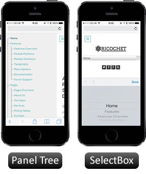
Responsive Mode: Smartphone

For mobile devices, there are two options, a dropdown panel menu with items in a tree format or a select box using the browsers own UI elements. Choose a format in the template's menu settings.

The mobile menu is active for both the Dropdown Menu and SplitMenu.
Typography

Headings

All HTML headings, <h1> through <h6> are available.

h1. Heading 1

h2. Heading 2

h3. Heading 3

h4. Heading 4

h5. Heading 5
h6. Heading 6

Built with Less

The typographic scale is based on two LESS variables in variables.less: @baseFontSize and @baseLineHeight. The first is the base font-size used throughout and the second is the base line-height. We use those variables and some simple math to create the margins, paddings, and line-heights of all our type and more. Customize them and Bootstrap adapts.

Body copy

Bootstrap's global default font-size is 14px, with a line-height of 1.7em. This is applied to the <body> and all paragraphs. In addition, <p> (paragraphs) receive a bottom margin of half their line-height (9px by default).

Nullam quis risus eget urna mollis ornare vel eu leo. Cum sociis natoque penatibus et magnis dis parturient montes, nascetur ridiculus mus. Nullam id dolor id nibh ultricies vehicula.

<p>...</p>

Lead body copy

Make a paragraph stand out by adding .lead.

Vivamus sagittis lacus vel augue laoreet rutrum faucibus dolor auctor. Duis mollis, est non commodo luctus.

<p class="lead">...</p>

Emphasis

Make use of HTML's default emphasis tags with lightweight styles.

<em>

For emphasizing a snippet of text with stress

The following snippet of text is rendered as italicized text.

<em>rendered as italicized text</em>

<strong>

For emphasizing a snippet of text with important

The following snippet of text is rendered as bold text.

<strong>rendered as bold text</strong>

<small>

For de-emphasizing inline or blocks of text, use the small tag.

This line of text is meant to be treated as fine print.

<p>
  <small>This line of text is meant to be treated as fine print.</small>
</p>

Note: Feel free to use <b> and <i> in HTML5. <b> is meant to highlight words or phrases without conveying additional importance while <i> is mostly for voice, technical terms, etc.

Notice Styles

Use the <p> tag with .success, .warning, .info or .error classes.

Nullam quis risus eget urna mollis ornare vel eu leo. Cum sociis natoque penatibus et magnis dis parturient montes, nascetur ridiculus mus.

<p class="success">...</p>

Nullam quis risus eget urna mollis ornare vel eu leo. Cum sociis natoque penatibus et magnis dis parturient montes, nascetur ridiculus mus.

<p class="info">...</p>

Nullam quis risus eget urna mollis ornare vel eu leo. Cum sociis natoque penatibus et magnis dis parturient montes, nascetur ridiculus mus.

<p class="warning">...</p>

Nullam quis risus eget urna mollis ornare vel eu leo. Cum sociis natoque penatibus et magnis dis parturient montes, nascetur ridiculus mus.

<p class="error">...</p>

Abbreviations

Stylized implementation of HTML's <abbr> element for abbreviations and acronyms to show the expanded version on hover. Abbreviations with a title attribute have a light dotted bottom border and a help cursor on hover, providing additional context on hover.

<abbr>

For expanded text on long hover of an abbreviation, include the title attribute.

An abbreviation of the word attribute is attr.

<abbr title="attribute">attr</abbr>

<abbr class="initialism">

Add .initialism to an abbreviation for a slightly smaller font-size.

HTML is the best thing since sliced bread.

<abbr title="attribute" class="initialism">attr</abbr>

Addresses

Stylized implementation of HTML's element to present contact information for the nearest ancestor or the entire body of work.

<address>

Preserve formatting by ending all lines with <br>.

<address>
  <strong>Twitter, Inc.</strong><br>
  795 Folsom Ave, Suite 600<br>
  San Francisco, CA 94107<br>
  <abbr title="Phone">P:</abbr> (123) 456-7890
</address>
<address>
  <strong>Full Name</strong><br>
  <a href="mailto:#">first.last@gmail.com</a>
</address>

Blockquotes

For quoting blocks of content from another source within your document.

Default blockquote

Wrap <blockquote> around any HTML as the quote. For straight quotes we recommend a <p>.

Lorem ipsum dolor sit amet, consectetur adipiscing elit. Integer posuere erat a ante.

<blockquote>
  <p>Lorem ipsum dolor sit amet, consectetur adipiscing elit. Integer posuere erat a ante.</p>
</blockquote>

Blockquote options

Style and content changes for simple variations on a standard blockquote.

Naming a source

Add <small> tag for identifying the source. Wrap the name of the source work in <cite>.

Lorem ipsum dolor sit amet, consectetur adipiscing elit. Integer posuere erat a ante.

Someone famous in Source Title
<blockquote>
  <p>Lorem ipsum dolor sit amet, consectetur adipiscing elit. Integer posuere erat a ante.</p>
  <small>Someone famous <cite title="Source Title">Source Title</cite></small>
</blockquote>

Alternate displays

Use .pull-right for a floated, right-aligned blockquote.

Lorem ipsum dolor sit amet, consectetur adipiscing elit. Integer posuere erat a ante.

Someone famous in Source Title
<blockquote class="pull-right">
  ...
</blockquote>

Lists

Unordered

This will display a list of items in which the order does not explicitly matter.

  • Lorem ipsum dolor sit amet
  • Nulla volutpat aliquam velit
    • Phasellus iaculis neque
    • Purus sodales ultricies
    • Vestibulum laoreet porttitor sem
    • Ac tristique libero volutpat at
  • Faucibus porta lacus fringilla vel
  • Eget porttitor lorem
<ul>
  <li>...</li>
</ul>

Ordered

This will display a list of items in which the order does explicitly matter (numbered list).

  1. Lorem ipsum dolor sit amet
  2. Consectetur adipiscing elit
  3. Integer molestie lorem at massa
  4. Facilisis in pretium nisl aliquet
  5. Nulla volutpat aliquam velit
  6. Faucibus porta lacus fringilla vel
  7. Aenean sit amet erat nunc
  8. Eget porttitor lorem
<ol>
  <li>...</li>
</ol>

Unstyled

This will display a list of items with no list-style or additional left padding.

  • Lorem ipsum dolor sit amet
  • Nulla volutpat aliquam velit
    • Phasellus iaculis neque
    • Purus sodales ultricies
    • Vestibulum laoreet porttitor sem
    • Ac tristique libero volutpat at
  • Faucibus porta lacus fringilla vel
  • Eget porttitor lorem
<ul class="unstyled">
  <li>...</li>
</ul>

Description

A list of terms with their associated descriptions.

Description lists
A description list is perfect for defining terms.
Euismod
Vestibulum id ligula porta felis euismod semper eget lacinia odio sem nec elit.
Donec id elit non mi porta gravida at eget metus.
Malesuada porta
Etiam porta sem malesuada magna mollis euismod.
<dl>
  <dt>...</dt>
  <dd>...</dd>
</dl>

Note: Horizontal description lists will truncate terms that are too long to fit in the left column fix text-overflow. In narrower viewports, they will change to the default stacked layout.

Horizontal description

Make terms and descriptions in <dl> line up side-by-side.

Description lists
A description list is perfect for defining terms.
Euismod
Vestibulum id ligula porta felis euismod semper eget lacinia odio sem nec elit.
Donec id elit non mi porta gravida at eget metus.
Malesuada porta
Etiam porta sem malesuada magna mollis euismod.
Felis euismod semper eget lacinia
Fusce dapibus, tellus ac cursus commodo, tortor mauris condimentum nibh, ut fermentum massa justo sit amet risus.
<dl class="dl-horizontal">
  <dt>...</dt>
  <dd>...</dd>
</dl>

Inline

Wrap inline snippets of code with <code>.

For example, <section> should be wrapped as inline.
For example, <code><section></code> should be wrapped as inline.

Note: Be sure to keep code within <pre> tags as close to the left as possible; it will render all tabs.

You may optionally add the .pre-scrollable class which will set a max-height of 350px and provide a y-axis scrollbar.

Basic block

Use <pre> for multiple lines of code. Be sure to escape any angle brackets in the code for proper rendering.

<p>Sample text here...</p>
<pre>
  &lt;p&gt;Sample text here...&lt;/p&gt;
</pre>

Prettify

To add colored syntax highlight to the <pre> tag, then use the .prettyprint class or the .prettyprint linenums class.

<?php /** Begin Debug **/ if ($gantry->countModules('debug')) : ?>
    <div id="rt-debug">
    <div class="rt-container">
      <?php echo $gantry->displayModules('debug','standard','standard'); ?>
      <div class="clear"></div>
    </div>
  </div>
  <?php /** End Debug **/ endif; ?>
<pre class="prettyprint linenums"><?php /** Begin Debug **/ if ($gantry->countModules('debug')) : ?>
  <div id="rt-debug">
    <div class="rt-container">
      <?php echo $gantry->displayModules('debug','standard','standard'); ?>
      <div class="clear"></div>
    </div>
  </div>
  <?php /** End Debug **/ endif; ?></pre>

Default styles

For basic styling—light padding and only horizontal dividers—add the base class .table to any <table>.

# First Name Last Name Username
1 Mark Otto @mdo
2 Jacob Thornton @fat
3 Larry the Bird @twitter
<table class="table">
  …
</table>

Optional classes

Add any of the follow classes to the .table base class.

.table-striped

Adds zebra-striping to any table row within the <tbody> via the :nth-child CSS selector (not available in IE7-IE8).

# First Name Last Name Username
1 Mark Otto @mdo
2 Jacob Thornton @fat
3 Larry the Bird @twitter
<table class="table table-striped">
  …
</table>

.table-hover

Enable a hover state on table rows within a <tbody>.

# First Name Last Name Username
1 Mark Otto @mdo
2 Jacob Thornton @fat
3 Larry the Bird @twitter
<table class="table table-hover">
  …
</table>

.table-bordered

Add borders and rounded corners to the table.

# First Name Last Name Username
1 Mark Otto @mdo
Mark Otto @TwBootstrap
2 Jacob Thornton @fat
3 Larry the Bird @twitter
<table class="table table-bordered">
  …
</table>

.table-condensed

Makes tables more compact by cutting cell padding in half.

# First Name Last Name Username
1 Mark Otto @mdo
2 Jacob Thornton @fat
3 Larry the Bird @twitter
<table class="table table-condensed">
  …
</table>

Optional row classes

Use contextual classes to color table rows.

Class Description
.success Indicates a successful or positive action.
.error Indicates a dangerous or potentially negative action.
.warning Indicates a warning that might need attention.
.info Used as an alternative to the default styles.
# Product Payment Taken Status
1 TB - Monthly 01/04/2012 Approved
2 TB - Monthly 02/04/2012 Declined
3 TB - Monthly 03/04/2012 Pending
4 TB - Monthly 04/04/2012 Call in to confirm
...
  <tr class="success">
    <td>1</td>
    <td>TB - Monthly</td>
    <td>01/04/2012</td>
    <td>Approved</td>
  </tr>
...

Supported table markup

List of supported table HTML elements and how they should be used.

Tag Description
<table> Wrapping element for displaying data in a tabular format
<thead> Container element for table header rows (<tr>) to label table columns
<tbody> Container element for table rows (<tr>) in the body of the table
<tr> Container element for a set of table cells (<td> or <th>) that appears on a single row
<td> Default table cell
<th> Special table cell for column (or row, depending on scope and placement) labels
Must be used within a <thead>
<caption> Description or summary of what the table holds, especially useful for screen readers
<table>
  <caption>...</caption>
  <thead>
    <tr>
      <th>...</th>
      <th>...</th>
    </tr>
  </thead>
  <tbody>
    <tr>
      <td>...</td>
      <td>...</td>
    </tr>
  </tbody>
</table>

Default styles

Individual form controls receive styling, but without any required base class on the <form> or large changes in markup. Results in stacked, left-aligned labels on top of form controls.

Legend Example block-level help text here.
<form>
  <legend>Legend</legend>
  <label>Label name</label>
  <input type="text" placeholder="Type something…">
  <span class="help-block">Example block-level help text here.</span>
  <label class="checkbox">
    <input type="checkbox"> Check me out
  </label>
  <button type="submit" class="btn">Submit</button>
</form>

Optional layouts

Included with Bootstrap are three optional form layouts for common use cases.

Search form

Add .form-search to the form and .search-query to the <input> for an extra-rounded text input.

<form class="form-search">
  <input type="text" class="input-medium search-query">
  <button type="submit" class="btn">Search</button>
</form>

Inline form

Add .form-inline for left-aligned labels and inline-block controls for a compact layout.

<form class="form-inline">
  <input type="text" class="input-small" placeholder="Email">
  <input type="password" class="input-small" placeholder="Password">
  <label class="checkbox">
    <input type="checkbox"> Remember me
  </label>
  <button type="submit" class="btn">Sign in</button>
</form>

Horizontal form

Right align labels and float them to the left to make them appear on the same line as controls. Requires the most markup changes from a default form:

  • Add .form-horizontal to the form
  • Wrap labels and controls in .control-group
  • Add .control-label to the label
  • Wrap any associated controls in .controls for proper alignment
Legend
<form class="form-horizontal">
  <div class="control-group">
    <label class="control-label" for="inputEmail">Email</label>
    <div class="controls">
      <input type="text" id="inputEmail" placeholder="Email">
    </div>
  </div>
  <div class="control-group">
    <label class="control-label" for="inputPassword">Password</label>
    <div class="controls">
      <input type="password" id="inputPassword" placeholder="Password">
    </div>
  </div>
  <div class="control-group">
    <div class="controls">
      <label class="checkbox">
        <input type="checkbox"> Remember me
      </label>
      <button type="submit" class="btn">Sign in</button>
    </div>
  </div>
</form>

Supported form controls

Examples of standard form controls supported in an example form layout.

Inputs

Most common form control, text-based input fields. Includes support for all HTML5 types: text, password, datetime, datetime-local, date, month, time, week, number, email, url, search, tel, and color.

Requires the use of a specified type at all times.

<input type="text" placeholder="Text input">

Textarea

Form control which supports multiple lines of text. Change row attribute as necessary.

<textarea rows="3"></textarea>

Checkboxes and radios

Checkboxes are for selecting one or several options in a list while radios are for selecting one option from many.

Default (stacked)


<label class="checkbox">
  <input type="checkbox" value="">
  Option one is this and that—be sure to include why it's great
</label>

<label class="radio">
  <input type="radio" name="optionsRadios" id="optionsRadios1" value="option1" checked>
  Option one is this and that—be sure to include why it's great
</label>
<label class="radio">
  <input type="radio" name="optionsRadios" id="optionsRadios2" value="option2">
  Option two can be something else and selecting it will deselect option one
</label>

Inline checkboxes

Add the .inline class to a series of checkboxes or radios for controls appear on the same line.

<label class="checkbox inline">
  <input type="checkbox" id="inlineCheckbox1" value="option1"> 1
</label>
<label class="checkbox inline">
  <input type="checkbox" id="inlineCheckbox2" value="option2"> 2
</label>
<label class="checkbox inline">
  <input type="checkbox" id="inlineCheckbox3" value="option3"> 3
</label>

Selects

Use the default option or specify a multiple="multiple" to show multiple options at once.


<select>
  <option>1</option>
  <option>2</option>
  <option>3</option>
  <option>4</option>
  <option>5</option>
</select>

<select multiple="multiple">
  <option>1</option>
  <option>2</option>
  <option>3</option>
  <option>4</option>
  <option>5</option>
</select>

Extending form controls

Adding on top of existing browser controls, Bootstrap includes other useful form components.

Prepended and appended inputs

Add text or buttons before or after any text-based input. Do note that select elements are not supported here.

Default options

Wrap an .add-on and an input with one of two classes to prepend or append text to an input.

@

.00
<div class="input-prepend">
  <span class="add-on">@</span><input class="span2" id="prependedInput" size="16" type="text" placeholder="Username">
</div>
<div class="input-append">
  <input class="span2" id="appendedInput" size="16" type="text"><span class="add-on">.00</span>
</div>

Search form

<form class="form-search">
  <div class="input-append">
    <input type="text" class="span2 search-query">
    <button type="submit" class="btn">Search</button>
  </div>
  <div class="input-prepend">
    <button type="submit" class="btn">Search</button>
    <input type="text" class="span2 search-query">
  </div>
</form>

Combined

Use both classes and two instances of .add-on to prepend and append an input.

$ .00
<div class="input-prepend input-append">
  <span class="add-on">$</span><input class="span2" id="appendedPrependedInput" size="16" type="text"><span class="add-on">.00</span>
</div>

Buttons instead of text

Instead of a <span> with text, use a .btn to attach a button (or two) to an input.


<div class="input-append">
  <input class="span2" id="appendedInputButton" size="16" type="text"><button class="btn" type="button">Go!</button>
</div>

<div class="input-append">
  <input class="span2" id="appendedInputButtons" size="16" type="text"><button class="btn" type="button">Search</button><button class="btn" type="button">Options</button>
</div>

Form actions

End a form with a group of actions (buttons). When placed within a .form-horizontal, the buttons will automatically indent to line up with the form controls.

<div class="form-actions">
  <button type="submit" class="btn btn-primary">Save changes</button>
  <button type="button" class="btn">Cancel</button>
</div>

Help text

Inline and block level support for help text that appears around form controls.

Inline help

Inline help text
<input type="text"><span class="help-inline">Inline help text</span>

Block help

A longer block of help text that breaks onto a new line and may extend beyond one line.
<input type="text"><span class="help-block">A longer block of help text that breaks onto a new line and may extend beyond one line.</span>

Control sizing

Use relative sizing classes like .input-large or match your inputs to the grid column sizes using .span* classes.

Relative sizing


<input class="input-mini" type="text" placeholder=".input-mini">
<input class="input-small" type="text" placeholder=".input-small">
<input class="input-medium" type="text" placeholder=".input-medium">
<input class="input-large" type="text" placeholder=".input-large">
<input class="input-xlarge" type="text" placeholder=".input-xlarge">
<input class="input-xxlarge" type="text" placeholder=".input-xxlarge">

Note: In future versions, we'll be altering the use of these relative input classes to match our button sizes. For example, .input-large will increase the padding and font-size of an input.

Uneditable inputs

Present data in a form that's not editable without using actual form markup.

Some value here
<span class="input-xlarge uneditable-input">Some value here</span>

Form control states

Provide feedback to users or visitors with basic feedback states on form controls and labels.

Input focus

We remove the default outline styles on some form controls and apply a box-shadow in its place for :focus.

<input class="input-xlarge" id="focusedInput" type="text" value="This is focused...">

Disabled inputs

Add the disabled attribute on an input to prevent user input and trigger a slightly different look.

<input class="input-xlarge" id="disabledInput" type="text" placeholder="Disabled input here..." disabled>

Validation states

Bootstrap includes validation styles for error, warning, and success messages. To use, add the appropriate class to the surrounding .control-group.

Something may have gone wrong
Please correct the error
Username is taken
Woohoo!
<div class="control-group warning">
  <label class="control-label" for="inputWarning">Input with warning</label>
  <div class="controls">
    <input type="text" id="inputWarning">
    <span class="help-inline">Something may have gone wrong</span>
  </div>
</div>
<div class="control-group error">
  <label class="control-label" for="inputError">Input with error</label>
  <div class="controls">
    <input type="text" id="inputError">
    <span class="help-inline">Please correct the error</span>
  </div>
</div>
<div class="control-group info">
  <label class="control-label" for="inputError">Input with info</label>
  <div class="controls">
    <input type="text" id="inputError">
    <span class="help-inline">Username is taken</span>
  </div>
</div>
<div class="control-group success">
  <label class="control-label" for="inputSuccess">Input with success</label>
  <div class="controls">
    <input type="text" id="inputSuccess">
    <span class="help-inline">Woohoo!</span>
  </div>
</div>

Default buttons

Button styles can be applied to anything with the .btn class applied. However, typically you'll want to apply these to only <a> and <button> elements for the best rendering.

Button class="" Description
btn Standard gray button with gradient
btn btn-primary Provides extra visual weight and identifies the primary action in a set of buttons
btn btn-info Used as an alternative to the default styles
btn btn-success Indicates a successful or positive action
btn btn-warning Indicates caution should be taken with this action
btn btn-danger Indicates a dangerous or potentially negative action
btn btn-inverse Alternate dark gray button, not tied to a semantic action or use
btn btn-link Deemphasize a button by making it look like a link while maintaining button behavior

Cross browser compatibility

IE9 doesn't crop background gradients on rounded corners, so we remove it. Related, IE9 jankifies disabled button elements, rendering text gray with a nasty text-shadow that we cannot fix.

Button sizes

Fancy larger or smaller buttons? Add .btn-large, .btn-small, or .btn-mini for additional sizes.

<p>
  <button class="btn btn-large btn-primary" type="button">Large button</button>
  <button class="btn btn-large" type="button">Large button</button>
</p>
<p>
  <button class="btn btn-primary" type="button">Default button</button>
  <button class="btn" type="button">Default button</button>
</p>
<p>
  <button class="btn btn-small btn-primary" type="button">Small button</button>
  <button class="btn btn-small" type="button">Small button</button>
</p>
<p>
  <button class="btn btn-mini btn-primary" type="button">Mini button</button>
  <button class="btn btn-mini" type="button">Mini button</button>
</p>

Create block level buttons—those that span the full width of a parent— by adding .btn-block.

<button class="btn btn-large btn-block btn-primary" type="button">Block level button</button>
<button class="btn btn-large btn-block" type="button">Block level button</button>

Disabled state

Make buttons look unclickable by fading them back 50%.

Anchor element

Add the .disabled class to <a> buttons.

Primary link Link

<a href="#" class="btn btn-large btn-primary disabled">Primary link</a>
<a href="#" class="btn btn-large disabled">Link</a>

Note: We use .disabled as a utility class here, similar to the common .active class, so no prefix is required.

Button element

Add the disabled attribute to <button> buttons.

<button type="button" class="btn btn-large btn-primary disabled" disabled="disabled">Primary button</button>
<button type="button" class="btn btn-large" disabled>Button</button>

One class, multiple tags

Use the .btn class on an <a>, <button>, or <input> element.

Link
<a class="btn" href="">Link</a>
<button class="btn" type="submit">Button</button>
<input class="btn" type="button" value="Input">
<input class="btn" type="submit" value="Submit">

As a best practice, try to match the element for your context to ensure matching cross-browser rendering. If you have an input, use an <input type="submit"> for your button.

Icons

Font Awesome (v.4+)

Font Awesome is a pictographic language of web-related actions which delivers over 300 icons. The Font Awesome webfont is created by Dave Gandy and licensed under SIL OFL 1.1. The code is licensed under MIT License.

Add fa fa-ICON_NAME to any element.

Download
<i class="fa fa-ICON_NAME"></i> ...
<i class="fa fa-download"></i> Download
You can find the full examples of usage at Font Awesome - http://fontawesome.io/icons/.

Module Variations

There are 8 stylistic module class suffixes which provide a unique style variation to the module: title1-4 and box1-4. There are also various additional structural suffixes, these affect the layout and metrics of the module.

Furthermore, you can also add FontAwesome icons into the Module Class Suffix. You will get a medium sized icon to the left of the title. Suffixes are in the fa fa-ICON_NAME.

image

Mobile Menu

  • Panel
  • SelectBox

Choose between a side panel menu or selectbox for small / mobile devices.