Headings
All HTML headings, <h1> through <h6> are available.
h1. Heading 1
h2. Heading 2
h3. Heading 3
h4. Heading 4
h5. Heading 5
h6. Heading 6
Built with Less
The typographic scale is based on two LESS variables in variables.less: @baseFontSize and @baseLineHeight. The first is the base font-size used throughout and the second is the base line-height. We use those variables and some simple math to create the margins, paddings, and line-heights of all our type and more. Customize them and Bootstrap adapts.
Body copy
Bootstrap's global default font-size is 14px, with a line-height of 1.7em. This is applied to the <body> and all paragraphs. In addition, <p> (paragraphs) receive a bottom margin of half their line-height (9px by default).
Nullam quis risus eget urna mollis ornare vel eu leo. Cum sociis natoque penatibus et magnis dis parturient montes, nascetur ridiculus mus. Nullam id dolor id nibh ultricies vehicula.
<p>...</p>
Lead body copy
Make a paragraph stand out by adding .lead.
Vivamus sagittis lacus vel augue laoreet rutrum faucibus dolor auctor. Duis mollis, est non commodo luctus.
<p class="lead">...</p>
Emphasis
Make use of HTML's default emphasis tags with lightweight styles.
<em>
For emphasizing a snippet of text with stress
The following snippet of text is rendered as italicized text.
<em>rendered as italicized text</em>
<strong>
For emphasizing a snippet of text with important
The following snippet of text is rendered as bold text.
<strong>rendered as bold text</strong>
<small>
For de-emphasizing inline or blocks of text, use the small tag.
This line of text is meant to be treated as fine print.
<p>
  <small>This line of text is meant to be treated as fine print.</small>
</p>
Note: Feel free to use <b> and <i> in HTML5. <b> is meant to highlight words or phrases without conveying additional importance while <i> is mostly for voice, technical terms, etc.
Notice Styles
Use the <p> tag with .success, .warning, .info or .error classes.
Nullam quis risus eget urna mollis ornare vel eu leo. Cum sociis natoque penatibus et magnis dis parturient montes, nascetur ridiculus mus.
<p class="success">...</p>
Nullam quis risus eget urna mollis ornare vel eu leo. Cum sociis natoque penatibus et magnis dis parturient montes, nascetur ridiculus mus.
<p class="info">...</p>
Nullam quis risus eget urna mollis ornare vel eu leo. Cum sociis natoque penatibus et magnis dis parturient montes, nascetur ridiculus mus.
<p class="warning">...</p>
Nullam quis risus eget urna mollis ornare vel eu leo. Cum sociis natoque penatibus et magnis dis parturient montes, nascetur ridiculus mus.
<p class="error">...</p>
Abbreviations
Stylized implementation of HTML's <abbr> element for abbreviations and acronyms to show the expanded version on hover. Abbreviations with a title attribute have a light dotted bottom border and a help cursor on hover, providing additional context on hover.
<abbr>
For expanded text on long hover of an abbreviation, include the title attribute.
An abbreviation of the word attribute is attr.
<abbr title="attribute">attr</abbr>
<abbr class="initialism">
Add .initialism to an abbreviation for a slightly smaller font-size.
HTML is the best thing since sliced bread.
<abbr title="attribute" class="initialism">attr</abbr>
Addresses
Stylized implementation of HTML's element to present contact information for the nearest ancestor or the entire body of work.
<address>
Preserve formatting by ending all lines with <br>.
<address>
  <strong>Twitter, Inc.</strong><br>
  795 Folsom Ave, Suite 600<br>
  San Francisco, CA 94107<br>
  <abbr title="Phone">P:</abbr> (123) 456-7890
</address>
<address>
  <strong>Full Name</strong><br>
  <a href="mailto:#">first.last@gmail.com</a>
</address>
Blockquotes
For quoting blocks of content from another source within your document.
Default blockqoute
Wrap <blockquote> around any HTML as the quote. For straight quotes we recommend a <p>.
Lorem ipsum dolor sit amet, consectetur adipiscing elit. Integer posuere erat a ante.
<blockquote>
  <p>Lorem ipsum dolor sit amet, consectetur adipiscing elit. Integer posuere erat a ante.</p>
</blockquote>
Blockquote options
Style and content changes for simple variations on a standard blockquote.
Naming a source
Add <small> tag for identifying the source. Wrap the name of the source work in <cite>.
Lorem ipsum dolor sit amet, consectetur adipiscing elit. Integer posuere erat a ante.
Someone famous in Source Title
<blockquote>
  <p>Lorem ipsum dolor sit amet, consectetur adipiscing elit. Integer posuere erat a ante.</p>
  <small>Someone famous <cite title="Source Title">Source Title</cite></small>
</blockquote>
Alternate displays
Use .pull-right for a floated, right-aligned blockquote.
Lorem ipsum dolor sit amet, consectetur adipiscing elit. Integer posuere erat a ante.
Someone famous in Source Title
<blockquote class="pull-right">
  ...
</blockquote>
Lists
Unordered
This will display a list of items in which the order does not explicitly matter.
- Lorem ipsum dolor sit amet
- Nulla volutpat aliquam velit
- Phasellus iaculis neque
- Purus sodales ultricies
- Vestibulum laoreet porttitor sem
- Ac tristique libero volutpat at
- Faucibus porta lacus fringilla vel
- Eget porttitor lorem
<ul>
  <li>...</li>
</ul>
Ordered
This will display a list of items in which the order does explicitly matter (numbered list).
- Lorem ipsum dolor sit amet
- Consectetur adipiscing elit
- Integer molestie lorem at massa
- Facilisis in pretium nisl aliquet
- Nulla volutpat aliquam velit
- Faucibus porta lacus fringilla vel
- Aenean sit amet erat nunc
- Eget porttitor lorem
<ol>
  <li>...</li>
</ol>
Unstyled
This will display a list of items with no list-style or additional left padding.
- Lorem ipsum dolor sit amet
- Nulla volutpat aliquam velit
- Phasellus iaculis neque
- Purus sodales ultricies
- Vestibulum laoreet porttitor sem
- Ac tristique libero volutpat at
- Faucibus porta lacus fringilla vel
- Eget porttitor lorem
<ul class="unstyled">
  <li>...</li>
</ul>
Description
A list of terms with their associated descriptions.
- Description lists
- A description list is perfect for defining terms.
- Euismod
- Vestibulum id ligula porta felis euismod semper eget lacinia odio sem nec elit.
- Donec id elit non mi porta gravida at eget metus.
- Malesuada porta
- Etiam porta sem malesuada magna mollis euismod.
<dl>
  <dt>...</dt>
  <dd>...</dd>
</dl>
Note:
Horizontal description lists will truncate terms that are too long to fit in the left column fix text-overflow. In narrower viewports, they will change to the default stacked layout.
Horizontal description
Make terms and descriptions in <dl> line up side-by-side.
- Description lists
- A description list is perfect for defining terms.
- Euismod
- Vestibulum id ligula porta felis euismod semper eget lacinia odio sem nec elit.
- Donec id elit non mi porta gravida at eget metus.
- Malesuada porta
- Etiam porta sem malesuada magna mollis euismod.
- Felis euismod semper eget lacinia
- Fusce dapibus, tellus ac cursus commodo, tortor mauris condimentum nibh, ut fermentum massa justo sit amet risus.
<dl class="dl-horizontal">
  <dt>...</dt>
  <dd>...</dd>
</dl>
Inline
Wrap inline snippets of code with <code>.
For example, <section> should be wrapped as inline.
For example, <code><section></code> should be wrapped as inline.
Note: Be sure to keep code within <pre> tags as close to the left as possible; it will render all tabs.
You may optionally add the .pre-scrollable class which will set a max-height of 350px and provide a y-axis scrollbar.
Basic block
Use <pre> for multiple lines of code. Be sure to escape any angle brackets in the code for proper rendering.
<p>Sample text here...</p>
<pre>
<p>Sample text here...</p>
</pre>
Prettify
To add colored syntax highlight to the <pre> tag, then use the .prettyprint class or the .prettyprint linenums class.
<?php /** Begin Debug **/ if ($gantry->countModules('debug')) : ?>
    <div id="rt-debug">
    <div class="rt-container">
      <?php echo $gantry->displayModules('debug','standard','standard'); ?>
      <div class="clear"></div>
    </div>
  </div>
  <?php /** End Debug **/ endif; ?>
<pre class="prettyprint linenums"><?php /** Begin Debug **/ if ($gantry->countModules('debug')) : ?>
  <div id="rt-debug">
    <div class="rt-container">
      <?php echo $gantry->displayModules('debug','standard','standard'); ?>
      <div class="clear"></div>
    </div>
  </div>
  <?php /** End Debug **/ endif; ?></pre>
Default styles
For basic styling—light padding and only horizontal dividers—add the base class .table to any <table>.
| # |
First Name |
Last Name |
Username |
| 1 |
Mark |
Otto |
@mdo |
| 2 |
Jacob |
Thornton |
@fat |
| 3 |
Larry |
the Bird |
@twitter |
<table class="table">
  …
</table>
Optional classes
Add any of the follow classes to the .table base class.
.table-striped
Adds zebra-striping to any table row within the <tbody> via the :nth-child CSS selector (not available in IE7-IE8).
| # |
First Name |
Last Name |
Username |
| 1 |
Mark |
Otto |
@mdo |
| 2 |
Jacob |
Thornton |
@fat |
| 3 |
Larry |
the Bird |
@twitter |
<table class="table table-striped">
  …
</table>
.table-hover
Enable a hover state on table rows within a <tbody>.
| # |
First Name |
Last Name |
Username |
| 1 |
Mark |
Otto |
@mdo |
| 2 |
Jacob |
Thornton |
@fat |
| 3 |
Larry the Bird |
@twitter |
<table class="table table-hover">
  …
</table>
.table-bordered
Add borders and rounded corners to the table.
| # |
First Name |
Last Name |
Username |
| 1 |
Mark |
Otto |
@mdo |
| Mark |
Otto |
@TwBootstrap |
| 2 |
Jacob |
Thornton |
@fat |
| 3 |
Larry the Bird |
@twitter |
<table class="table table-bordered">
  …
</table>
.table-condensed
Makes tables more compact by cutting cell padding in half.
| # |
First Name |
Last Name |
Username |
| 1 |
Mark |
Otto |
@mdo |
| 2 |
Jacob |
Thornton |
@fat |
| 3 |
Larry the Bird |
@twitter |
<table class="table table-condensed">
  …
</table>
Optional row classes
Use contextual classes to color table rows.
| Class |
Description |
.success
|
Indicates a successful or positive action. |
.error
|
Indicates a dangerous or potentially negative action. |
.warning
|
Indicates a warning that might need attention. |
.info
|
Used as an alternative to the default styles. |
| # |
Product |
Payment Taken |
Status |
| 1 |
TB - Monthly |
01/04/2012 |
Approved |
| 2 |
TB - Monthly |
02/04/2012 |
Declined |
| 3 |
TB - Monthly |
03/04/2012 |
Pending |
| 4 |
TB - Monthly |
04/04/2012 |
Call in to confirm |
...
  <tr class="success">
    <td>1</td>
    <td>TB - Monthly</td>
    <td>01/04/2012</td>
    <td>Approved</td>
  </tr>
...
Supported table markup
List of supported table HTML elements and how they should be used.
| Tag |
Description |
<table>
|
Wrapping element for displaying data in a tabular format
|
<thead>
|
Container element for table header rows (<tr>) to label table columns
|
<tbody>
|
Container element for table rows (<tr>) in the body of the table
|
<tr>
|
Container element for a set of table cells (<td> or <th>) that appears on a single row
|
<td>
|
Default table cell
|
<th>
|
Special table cell for column (or row, depending on scope and placement) labels
Must be used within a <thead>
|
<caption>
|
Description or summary of what the table holds, especially useful for screen readers
|
<table>
  <caption>...</caption>
  <thead>
    <tr>
      <th>...</th>
      <th>...</th>
    </tr>
  </thead>
  <tbody>
    <tr>
      <td>...</td>
      <td>...</td>
    </tr>
  </tbody>
</table>
Icons
Font Awesome (v.4+)
Font Awesome is a pictographic language of web-related actions which delivers over 300 icons. The Font Awesome webfont is created by Dave Gandy and licensed under SIL OFL 1.1. The code is licensed under MIT License.
Add fa fa-ICON_NAME to any element.
Download
<i class="fa fa-ICON_NAME"></i> ...
<i class="fa fa-download"></i> Download
You can find the full examples of usage at Font Awesome - http://fontawesome.io/icons/.
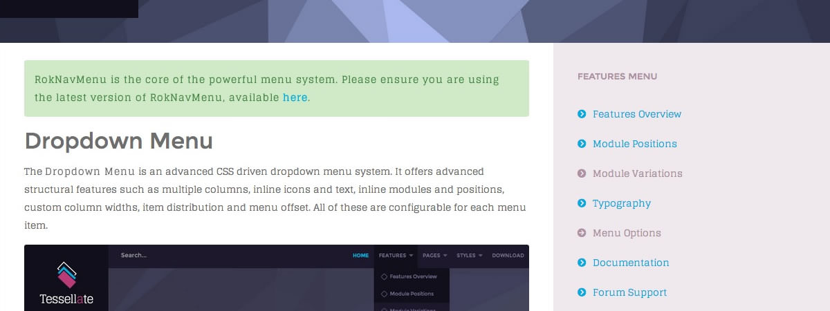
There are 8 stylistic module class suffixes which provide a unique style variation to the module: title1-4 and box1-4. There are also various additional structural suffixes, these affect the layout and metrics of the module.
Furthermore, you can also add FontAwesome icons into the Module Class Suffix. You will get a medium sized icon to the left of the title. Suffixes are in the fa fa-ICON_NAME.
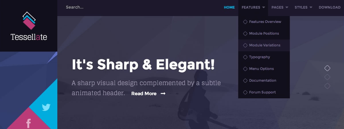
The Layouts panel in the Tessellate template administration interface provides several options for configuring the layout of the template. Each modular section of the template design offers six module positions by default.
Note: If no modules are published to a position, the entire area or row will not appear or collapse.
ExpandedBottom |
| A |
B |
C |
D |
E |
F |
Documentation: Gantry Framework Layouts