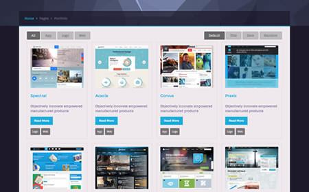
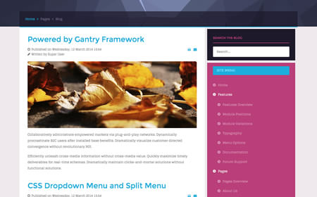
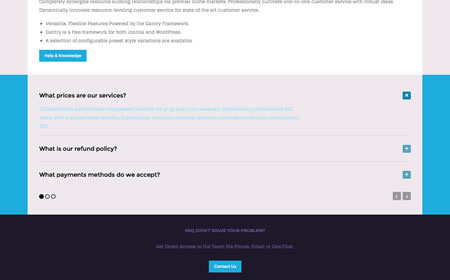
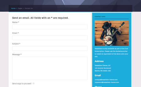
Multiple layout options: An adapted responsive layout, or fixed layouts at 960px or 1200px wide
A responsive layout adapts automatically to the viewing device's width, such as mobile, tablet or desktop, without the need for a separate layout or content. Mobile modes have a unique menu to aid usability. 960px and 1200px fixed layout options are also available.
Read More
Configure the style options of Tessellate, quickly and easily, in the template manager settings
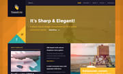
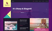
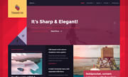
Tessellate has an extensive Color Chooser in the template manager to provide intricate controls for each section, inclusive of overlay type, text color, background color, as well as accent colors. Edit preexisting or create new presets.
Read More
A web font based solution for adding icons, allowing them to be extensively styled via CSS
The template features an updated library for Font Awesome with version 4+. This offers over 350 icons, which are fully scalable and easy to integrate into the design of the template and/or content, from module titles to inside content items themselves.
Read More
