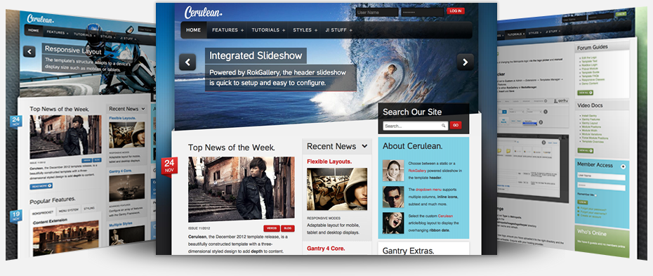
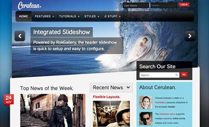
The next generation layout and structure compliments the beautiful and intricate design of the template in conjunction with its many features and integrated extensions
Inside Cerulean Template
Everything You Need to Build Your Stunning Website
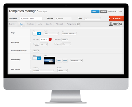
G 4 Framework
Powerful Framework that Makes Building Websites Easier
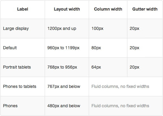
- Compact Grid System
CSS grid framework to construct content by providing commonly used dimensions
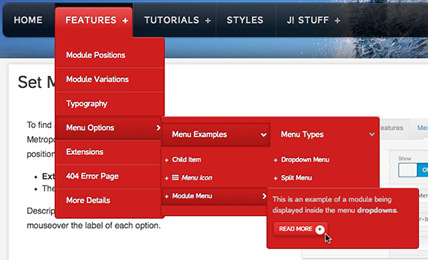
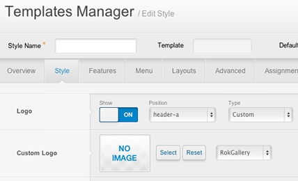
- Stunning Admin UI
Gantry provides a uniquely intuitive interface to control all aspects of the design
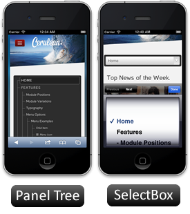
- Integrated Features
Many built-in features such as font-sizer, Google Analytics, Date, etc
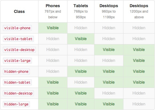
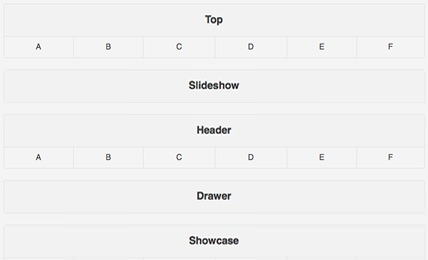
- Source-Ordered Layout
With up to 3 total sidebars, you can achieve highly complex mainbody layout scenarios
- Grid RTL Support
Built in RTL support which will automatically order the layout to support RTL
- Multi-Page Configuration
Assign different template configurations for one or several menu items/pages
Interested? Want to try Cerulean? Download